Learning how to read and understand trading charts is an essential skill if you plan to trade Bitcoin and other cryptocurrencies successfully. If you’re new to the cryptocurrency world or simply looking to get on your way to becoming a seasoned bitcoin trader, you’ll immediately notice how the amount of data and charts along with a million buzz words being thrown at you all at once can easily get overwhelming. While there is an infinite amount to get your head around, there are a few basics you should consider at first to help you set a solid learning foundation.
From learning technical analysis and all its associated jargon to actually knowing when to take a long or short position, reading a crypto chart can be pretty intimidating for beginners. This guide aims to simplify the process so you can better understand what crypto charts are showing you whether you are actively trading crypto assets or even just holding! This new skill will not only help you track the price of your favourite coin, but will also tell you a lot about the trend of the market as well.
What are Crypto Charts?
In simplest terms, crypto charts are graphic displays of current prices, trading volumes, and the overall momentum of the market. These charts are used by cryptocurrency traders and enthusiasts to help determine when to buy, when to sell, and when to “hodl”, a term commonly used in the context of Bitcoin and other cryptocurrencies that refers to a buy-and-hold strategy. This is why it is important to learn how to read them.
Understanding the Trends
A chart shows you a grouping of data plotted in a general direction, which helps you figure out an overall direction that an instrument is moving towards. This is the trend. These generally move in a series of peaks and valleys (highs and lows) and sideways (flat or horizontal). You’ve probably already heard of Bullish/Bearish movements, but if you haven't, they simply refer to the market trend over a given period. A Bullish trend is a succession of upward and positive movements, while a Bearish trend is a sequence of descending lows and highs. The sideways trend, on the other hand, occurs when the forces of demand and supply are equal, and is therefore depicted on the chart as more of a straight line than a view of valleys and peaks.
Another way to classify trends is by the time duration as the trend is taking place. In order to get a more robust understanding of the market, you’ll want to check out the long-term, short-term and intermediate trends. The prices of bitcoin, ethereum, litecoin, ripple, and other crypto assets are volatile, so it is important to consider the time duration of their price changes. For instance, bitcoin price is €9133.87 at the time of writing, but before you buy, you’ll want to examine its historical prices to get an idea of just how much the price has moved over the last few weeks or months. While this data is not 100% conclusive, it does give you a clearer picture of how the current bitcoin price came to be and if it is the right time to make a move.
Predicting Price Trends
The first thing to understand is that forecasting the price movements of any traded asset on an exchange is a risky probabilities game and no one is right all the time. That being said, it is still important to be able to predict these price trends as they are crucial to determining your actions in the market. There are two main approaches to predicting price development -- fundamental analysis and technical analysis.
In the financial market, fundamental analysis assesses the value and growth potential of a traded asset by critically examining the underlying forces of an economy, a company or a security at its most basic or fundamental financial level. The goal here is to assess key indicators to determine if the crypto asset is overvalued or undervalued. If the coin is deemed overvalued, then the expectation is that the market price will ultimately drop towards its fair value, which results in a sell recommendation. Alternatively, if the coin is deemed undervalued, then it is expected to rise to its fair value, which means it’s a good time to buy.
On the other hand, technical analysis attempts to forecast price movements based on past market data, historical prices, and volumes found on the charts. In other words, it’s about reading key indicators on the chart and using the data to predict whether the price will go up or down within a given period in the future. As a beginner, this method is easier to follow since it doesn't usually require lengthy and external research, and all the data you need is right there on the chart.
Types of Trading Charts
There are two main chart types that are popular among trading circles and each one has their level of information according to the traders’ individual skill level:
The Line Chart
This is one of the most basic charts you will come across and it closely resembles the charts you may remember from high school math. These charts show the coin’s simple progression over time, which is represented by a line showing the closing price of the coin over a period of time. This closing price is one of the most important elements in analysing data and is essentially how the line chart is formed -- connecting the closing prices over a set time frame.
The line represents the coin’s performance over a specified amount of time, making it simple and easy for you to ascertain whether it is a coin you would consider investing in. Check out the example below as we look at a simple line chart from one of the most popular tracking sites, CoinFalcon.com.

Data Source: CoinFalcon
Here’s a breakdown of some of its basic elements:
- The blue jagged moving line: This plots the price of BTC as it moves along the timeline
- The items on the bottom (Horizontal axis): This tells you the timeline that the chart is following, which you can change by clicking on the timescale options on the top right corner of the chart (1D, 1W, 1M, 1Y). In this example, the line chart shows the timeline for 1 Day.
- The figures on the left-hand side (Vertical axis): This shows you the bitcoin price at any point along the chart
- The H and L values on the blue line: These represent the high and low prices of the coin within that timeline
A careful study of a simple chart like this can tell you whether the market is in a bullish or bearish trend. These trends can be long term or short term, but the data they provide will ultimately dictate whether you should go for a buy or sell action.
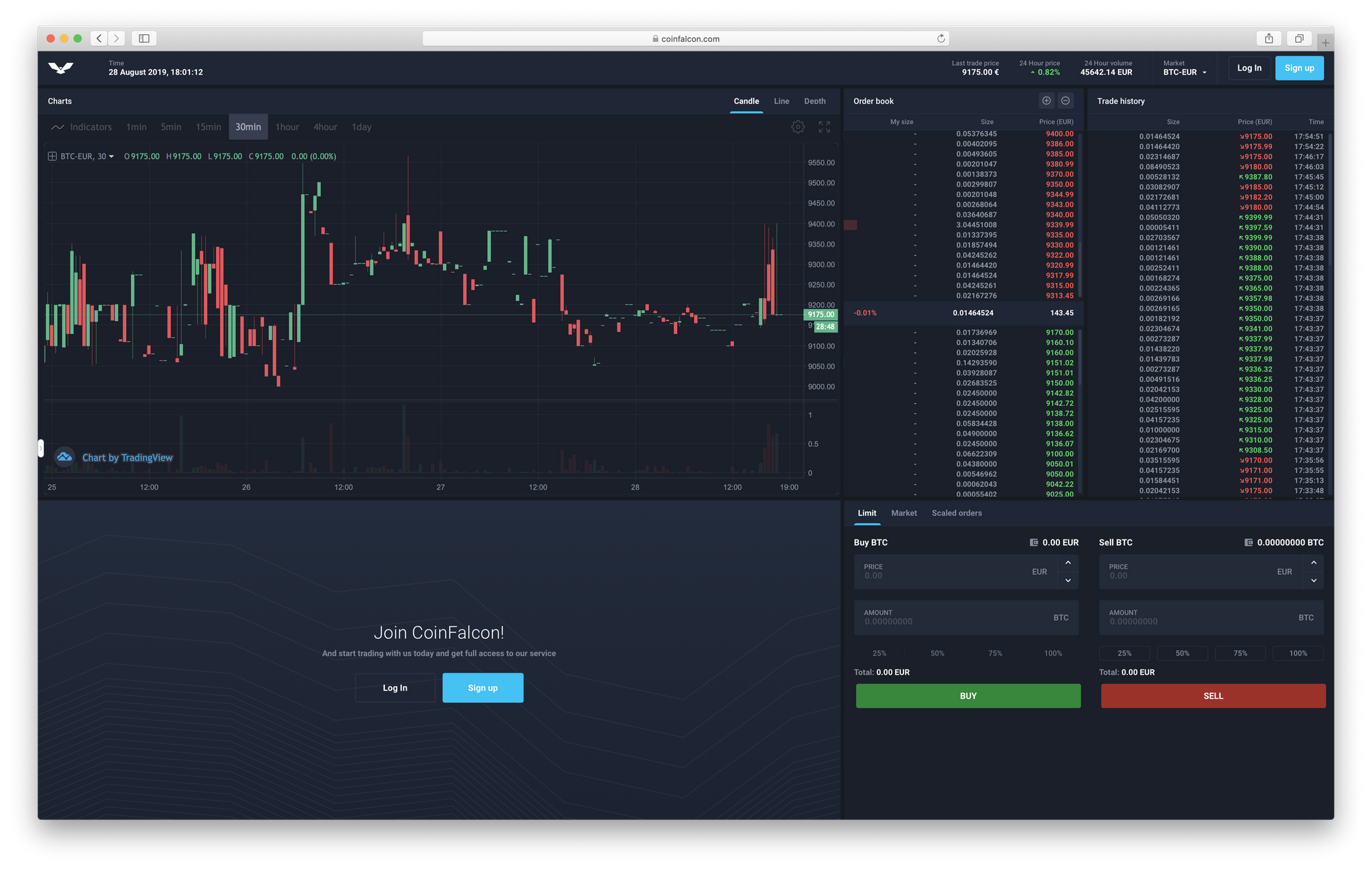
The Japanese Candlestick Chart
Also known as “The Traders Choice”, the candlestick trading chart is more advanced than the line chart and provides data on not just the closing price, but also information on things such as market cap, highest and lowest prices, and volume. In addition, the color of each “candle” indicates whether the closing price was higher than the opening price (usually a green bar) or lower than the opening price (usually with a red body). Much like the line chart, you can zoom in and out as well as change the timeline views. The patterns formed by groups of candlesticks display a much greater amount of detail about trading at any given moment and provide a more well-rounded picture of how a particular cryptocurrency is performing.
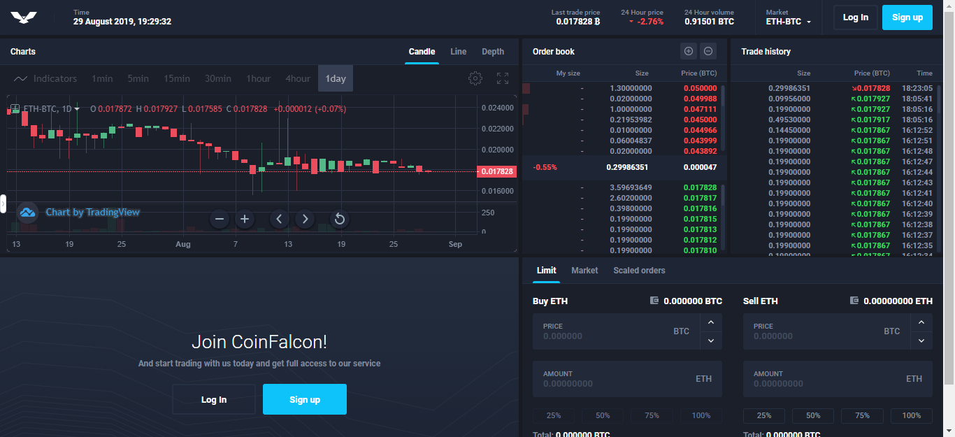
Data Source: CoinFalcon Advanced View
The good thing about cryptocurrency trading is that you are not limited to fiat currencies but can actually trade with other digital assets. For instance, the chart above is the daily candlestick chart for the ETH/BTC pairing. One of the first things you will notice is the red and green candlesticks lying one after another and each one shows you the price movement of the asset during that specific time interval. The "wick" or the lines at the top and bottom indicate the lowest and highest prices during the selected time. A good way to remember this is that the candle body shows the difference between the open and close prices, while the wicks indicate how high or low the prices have gone.
This type of chart is more useful for traders because it helps them to perform in-depth technical analysis to predict where the price will go next, and plan trades accordingly. Of course, whilst charts like these provide a good insight into the coin’s performance, there is still no way to predict what will happen with certainty.
What to Do Now
This quick guide is great and all, but what can you really do with it? Well at the very least, it should give you a basic understanding of how to read crypto charts and what all the numbers and figures mean. As you become more skilled in trading, you may come across some charts that are more complex or a bit different working, but they are very similar, for the most part.
A good idea is to start following the price development of bitcoin and your other favorite coins on a daily basis. Over time, you will inevitably start to notice certain regularities on the charts and become more acquainted with the trending behavior of prices. You can also use the charts for technical analysis to help you identify ideal buy and sell times. You will then look back to this point in time and remember it as the moment you took a giant step towards becoming a better cryptocurrency trader.
In addition to bitcoin, ethereum, bitcoin cash, litecoin, and ripple, CoinFalcon also supports other cryptocurrencies like Greenpower, EOS, Electra, IOTA, USDT, and Data TX Tokens, among others. So what are you waiting for? Now that you are equipped with some major chart reading knowledge, go forth, dive into some charts and get the future of money into your pockets!